Facebook's X Button Has a Trapdoor

The Grievance
You're watching a video. Nothing profound. A dog on a skateboard, or some bloke rendering a kitchen in Blender.
Then the banner arrives. Bottom third of the screen, sitting directly over the subtitles and the dog's back legs.
Fine. Free platform, sold attention, you know the arrangement. So you reach for the little grey x in the corner, because the arrangement includes an exit.
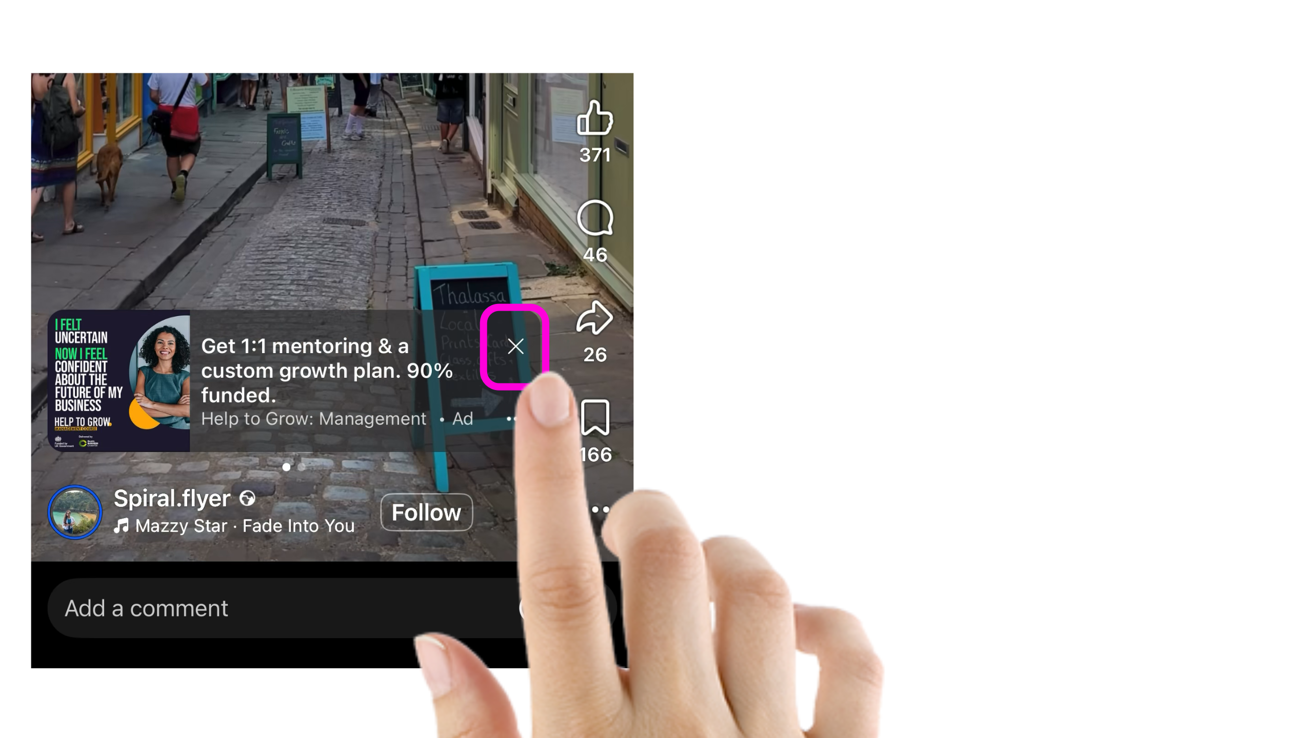
The x moves.
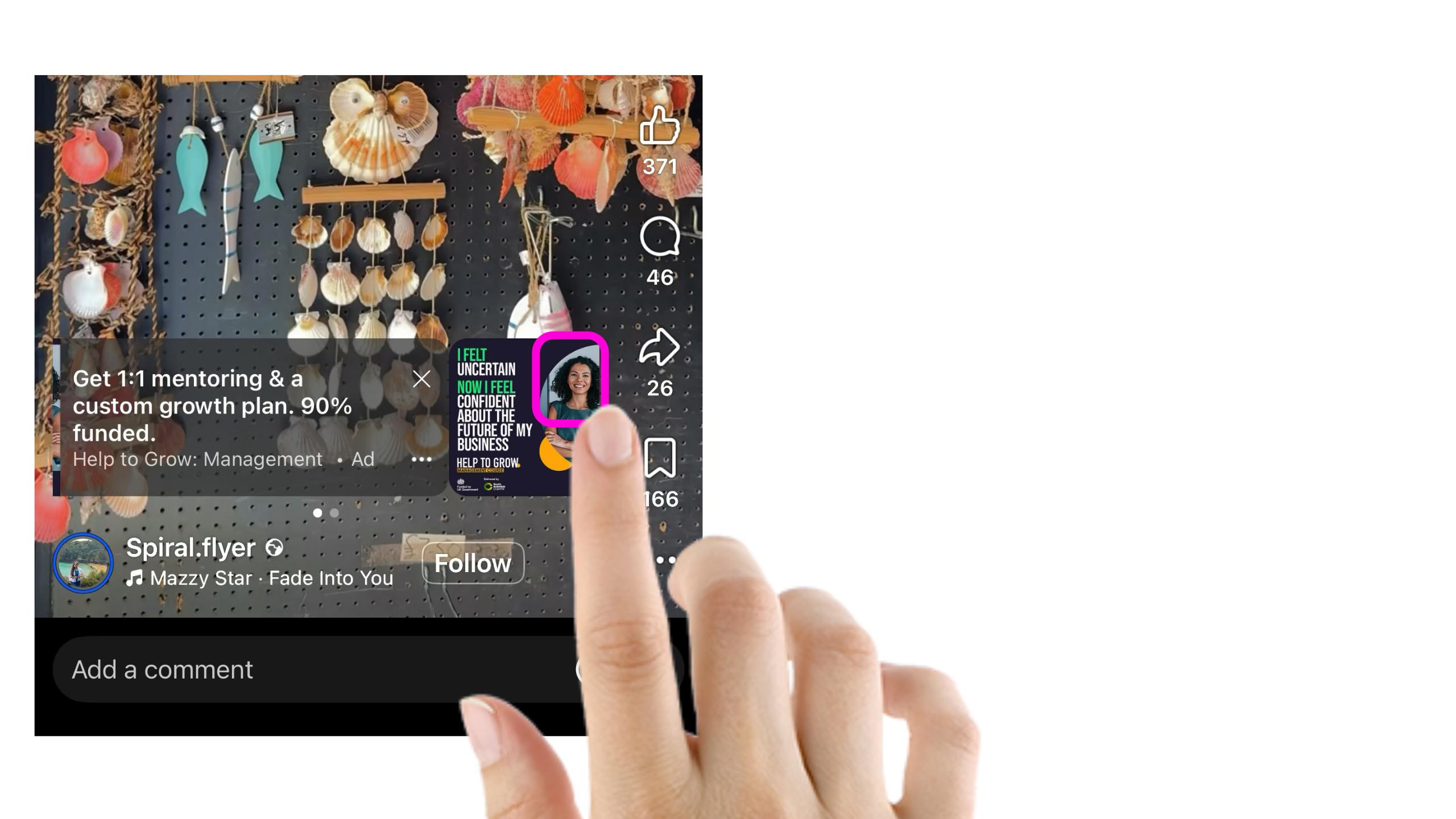
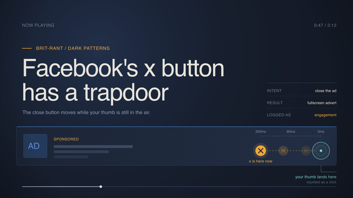
The banner carousel slides sideways at the precise moment your finger begins travelling. Your finger lands on empty pixels where the close button used to live. And now you're in a fullscreen advert for orthopaedic mattresses, and Meta has logged a click, and somewhere a spreadsheet says you were interested.
You weren't. You were leaving.
The Escalation
Give the thing a proper name. Harry Brignull coined "dark patterns" back in 2010, and this one sits in the category called interface interference. The design does the opposite of what the design appears to promise.
Here's why the moving x deserves a special sort of contempt.
A standard dark pattern lies to you. Pre-ticked consent boxes. Cancel buttons hidden behind four screens of pleading. Grim, yes, but at least the button stays still. You have a fair fight.
This one weaponises your own motor function. Between the decision in your head and the tap on the glass there's about 200 milliseconds of travel. Somebody looked at those 200 milliseconds and thought: monetisable.
And the numbers back the incentive. A 2022 behavioural study for the European Commission examined 75 of the most popular websites and apps across the EU and found 97 percent deployed at least one dark pattern. Not a rogue designer. Standard practice.
The DSA supposedly outlawed this. Article 25 bans platforms from designing interfaces which deceive users or impair their ability to make free choices, in force since February 2024. Meanwhile, on the phone in your hand, the x continues to scurry off to the left like a startled crab.
The truly infuriating part sits in the reporting. Your accidental fullscreen advert becomes a data point. Engagement. Interest signal. Then Meta charges the mattress company for your thumb's failed navigation, and the mattress company sees a click-through rate which suggests you fancied a new mattress, and next week you get fourteen more mattress adverts.
An entire economy built on people trying to leave.
The Conclusion
Nobody at Meta wrote a memo titled "make the close button run away". Nobody needed to. Optimise a carousel for impressions, A/B test the timing, keep whichever version earns more, and the cruelty assembles itself. The algorithm found the trapdoor without supervision, and no human has any reason to close it.
Which leaves you with three options, none of them satisfying.
Wait a full second before tapping, so the carousel settles first. Tedious, and you'll forget.
Report the advert as misleading. Slow, and largely theatre.
Or accept the platform treats your attention as inventory and your mistakes as revenue, then adjust how much of your evening you hand over.
Rubbish choices, all three. The design worked, though. Somebody got promoted for the carousel timing.
Watch your own finger/thumb next time the banner appears. Count how often you land on the advert instead of the exit. Then ask whether a platform earning money from your misses has any reason at all to fix the aim.